Car and Driver
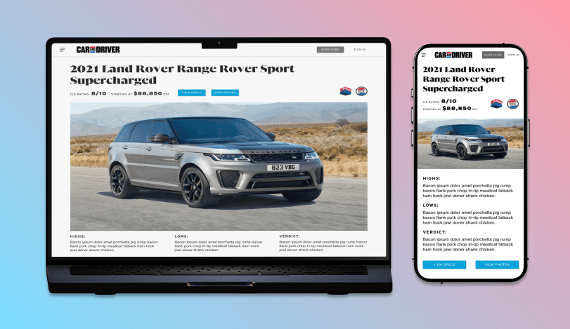
Bridging the gap between print and digital, I redesigned Car and Driver’s Make & Model page to create a more intuitive, visually striking, and information-rich experience for car enthusiasts and shoppers alike.
Project Details
Responsive Web Design & Brand Alignment
Landon Oliver (me), Sam Conant
Two Weeks
Overview: Unifying Print and Digital for Car Enthusiasts
Car and Driver is a trusted destination for automotive enthusiasts, offering everything from pricing breakdowns to detailed comfort ratings. During my time there, I focused on aligning the digital experience with the magazine’s refreshed print layout—starting with a full redesign of the Make & Model page.
As the lead designer on the project, I collaborated closely with developers, creative directors, and the magazine design team. My goal was to create a seamless bridge between print and digital, ensuring the UX felt intuitive, brand-consistent, and visually compelling.
Discovery: Researching Layouts & User Behavior
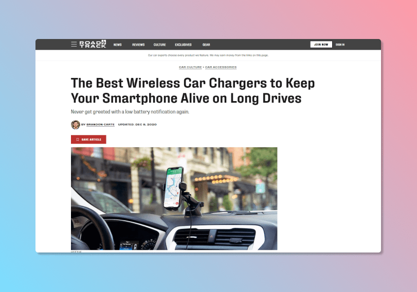
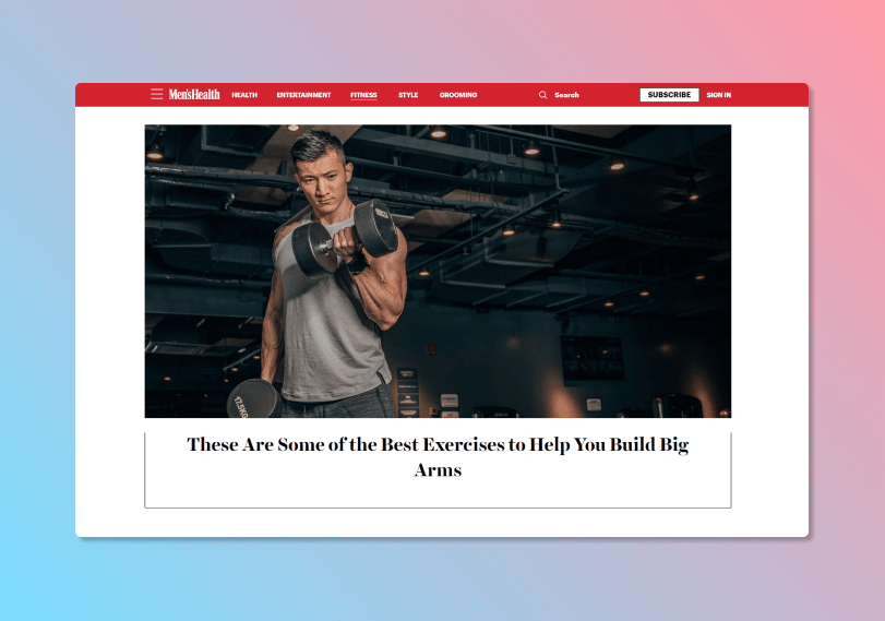
To kick off, I reviewed similar brands under Hearst Magazines—like Road & Track and Men’s Health—for layout and UI inspiration. These references stood out for their bold headers, clean imagery, and interactive design elements.
I also ran a round of user testing on our existing Make & Model page using UserTesting.com. The goal was to surface any usability issues, pain points, or content gaps. These insights became the foundation for redesign decisions.
Exploration: Sketching & Ideation
With feedback in hand, I sketched out the current structure and began ideating layout improvements. I focused on balancing editorial content, key specs, and visual clarity.
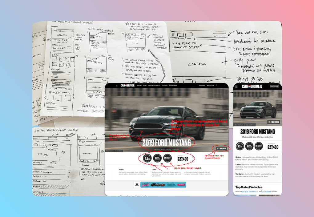
Moving into Figma, I built out early concepts using components from our design library—saving time and keeping everything on-brand. I explored multiple layout approaches for fonts, icons, buttons, and sectioning, using them as a base for creative review and brainstorming with the CD.
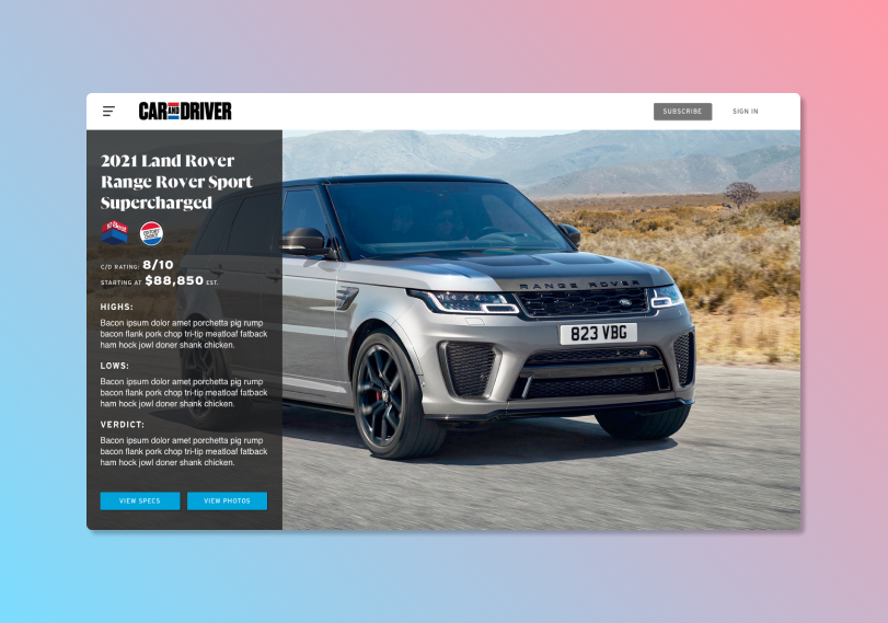
Design Iteration: Wireframes, Feedback & Testing
A major focus was structuring Make and Model details—like pricing, icons, and descriptions—in a way that was both readable and scannable. I developed multiple wireframe variations, tested them with the dev team, and led another round of user testing to validate the direction.
Each round of iteration brought clarity to what worked (and what didn’t), helping guide the final design forward with confidence.
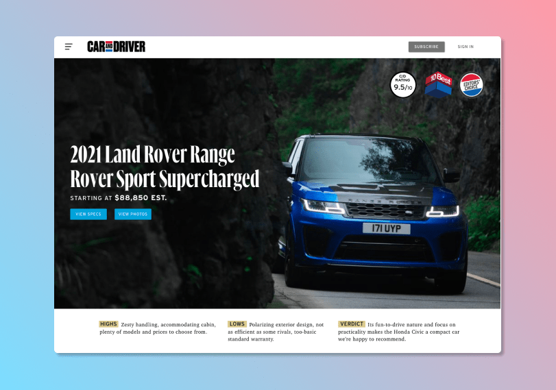
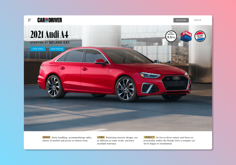
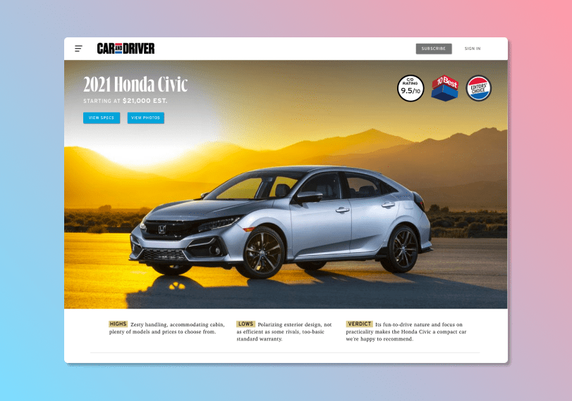
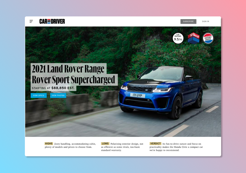
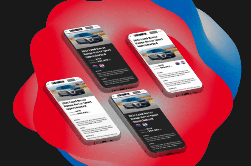
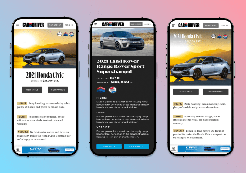
Final Design: Solving for Clarity & Function
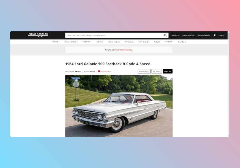
One of the biggest design challenges came from overlapping text and icons on hero images. To resolve this, I looked to Bring a Trailer’s header layout, which smartly balances content and clarity. I adopted a similar structure—introducing a bold title, secondary text, clear CTAs, and defined space for editorial tools.
This became the final structure we pushed into development: a more refined, modern experience that echoed the magazine’s new visual identity.
Impact: A Seamless Brand Experience
The redesign launched alongside Car and Driver’s updated print magazine, creating a cohesive brand moment across platforms. With over 500,000 active users engaging online, the results were both rewarding and impactful.
Key Takeaways
- Clear, ongoing communication across teams made this project a success
- Iteration, feedback, and testing are invaluable at every stage
- And most importantly, enjoying the creative process goes a long way